Showing posts with label watercolour. Show all posts

Sunday, January 26, 2014

Blue Siberian Iris in Watercolor

After many, many months away from my art blog, I’m back. No excuses. 

I won’t bore you with my plans to post more frequently. I won’t tell you about my exciting plans to move this blog to a new WordPress site with a portfolio section and all the bells and whistles. I will, however, ask you to please watch this space as I continue my art journey.

I did get my brushes wet in 2013. Here is my best watercolor effort from last year. I also took photos of it as a Work In Progress (WIP) so I’ll put together a video and post it here and on my YouTube channel so you can see more of the process.


Blue Iris, a Watercolor by Shannon A. Ragland
"Blue Iris" ©Shannon A. Ragland
Watercolor on Fabriano 140lb Cold-Pressed Paper
12"x15.5"
This is a blue siberian iris I have struggled to keep alive in my back yard. I may have to move it to get this beautiful bloom again, since my Basset hound loves to nose it and try to dig it up. 

Carry on! 
-Shannon

Sunday, August 16, 2009

Blue Ridge Parkway WIP

Had a wonderful trip back in May to Asheville and Winston Salem, NC as well as two moody, rainy days sketching and photographing views from peaks and overlooks along the Blue Ridge Parkway.

I wish I could remember which overlook produced the photo referenced in this painting. I'm taking a lot of license and trying to teach myself to loosen up and paint a simple, elegant landscape.

I admire the old English plein air landscape watercolourists as well as a few modern painters who exmplify this philosophy, such as Chris Robinson. 'Tis certainly not my instinctive nature - I tend to overwork - but I keep trying!

Stage 1:


Stage 2:


Going through a bit of an ugly stage...also this photo was taken at night under a special daylight bulb, but it doesn't compare well to the first. I may have overstrengthened some of the lines in the mountains...oh well, I'll just go with it and try more washiness in my next piece.


Stage 3:
Rinsed under the sink. Gradation is lost, and needs a little scrubby here and there. Moving on to the next piece!

Thursday, April 09, 2009

Happy Easter!

'Tis always shocking when I go to post and realize how time has flown since my last time here. I promised myself I would keep my brushes wet but have not been good about it.

But today is a new day! I painted this one last night...This is my second loose landscape...still learning. Did this fast...sunset in two layers (yellow, then dried...then other colors) in 15 minutes on wet paper, then once dry washed in the silhouette of trees in 5 minutes. I took the reference photo for this painting a couple of years ago at the farm...I did go off in my own direction.

11"x15" Arches 300 lb Cold Pressed
Quin Gold (WN), Perylene Maroon (DS), Indanthrone Blue (DS), Quin Violet (DS)

Friday, December 19, 2008

Sadie WIP Updated...

I finally finished my first pet portrait, my angel-dog Sadie. Please scroll down or click here to see her as a work in progress.

Saturday, November 22, 2008

"Spirit"


I painted this small piece (8.5" x 12") for the annual painting exchange over at CWForum.net. We commit to painting a small watermedia piece and the exchange leaders draw names out of a hat. We then mail them to one another in time for the holidays...a cool way to add to your art collection!

This is watercolor on 300-lb Arches Cold Pressed... just a corner of the den. The door and floor are original (1911), and are unusual because the door is six-panelled, and the floor was repaired many years ago after the kitchen burned in the first half of the century. The coffee grinder is an antique from Avignon, France - an engagement gift from Anthony's cousin. I have sent this little piece to Tom Powell, an incredible artist in Louisville, KY who loves the subtleties of detail as much as I do.

Paints: Ital Venetian Red (DS), Lavender (Holbein), Raw Sienna + Burnt Umber (WN) and transparents French Ultramarine Blue (WN) and Quin Burnt Orange (DS).

Saturday, October 27, 2007

"Proud"


My latest piece, Proud, is a different direction for me. It is 7" x 10" (which is pretty small for me) and is more illustrative than usual. I used this reference photo from MorgueFile since peacocks don't grow on trees.

This one is in the collection of my friend Harold Shull, an illustrator and artist for whom I have great respect. I am happy for him to own one of my little pieces!

I used Iridescent watercolors from Daniel Smith except for the blues, which are French Ultramarine from Winsor & Newton, and the Peacock Blue by Holbein. I used drybrush with a fan brush on the feathers to create a wispy feel while letting some of the paper shine through, keeping some whites. I wish my photo communicated the shimmer - it was so much fun to use such yummy paints. I used Iridescent Scarab Red by DS in the feathers - an awesome shimmery warm rust red, but has a warm yellow-green glow. So when you turn the paper it changes tone, just like a peacock's feathers.

Friday, July 06, 2007

"Seabrook Inlet'

Anthony and I spent a glorious early morning last summer watching the sunrise over the inlet at the south end of Seabrook Island, SC. I took a photograph but it doesn't do the scene much justice. It does, however, remind me of what the scene felt like, so it helped my painting memory quite well.
I kept this loose and abstract, focusing on the shapes, colors, and textures. I strayed away from reality to communicate what I love about the low country. That morning we saw dolphins swim up the creek within feet of us...it was incredible. So peaceful and quiet, with nary a wave and an unforgettable salty, marshy smell. The tall marsh grass is so beautiful to me, and the smell of marsh funk takes me back to my days living in the low country.

As for the technical side, this is pure watercolor on 300-Lb Arches Cold Press, a half sheet (15"x22") with Ox Gall added to the water for enhanced flow and spreadability. I used a limited palette of Permanent Rose (Winsor & Newton), New Gamboge (Daniel Smith), Cobalt Blue (Holbein), Sap Green (MaimeriBlu), Viridian (WN), and a touch of Italian Venetian Red (DS). This was more of a learning experience than a "finished" painting, but it is a record of where I am starting from with semi-abstract landscapes.

Tuesday, December 12, 2006

WIP (Work In Progress) - Sadie I

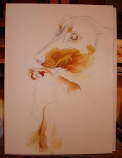
My sister, Circe, blogged about my little angel-dog over at Purrs & Scratches, so I was inspired to actually show you a WIP of a watercolor I am working on of my little munchkin. I am taking minor creative license, skewing the angle for the best composition.

Here is the preliminary drawing followed by the first step in rendering the doglet.

This is my first pet portrait, so keep your fingers crossed! Whatever I paint, I tend to start with the lightest values, especially any yellows, then jump into the darks.


On to the specs. This is woodless graphite and Winsor & Newton watercolor paints on Arches 140-Lb. Hot Press paper (here I am working on a 10" x 14" block). Thus far the paints used are Raw Sienna, Quinacridone Gold, Burnt Sienna, and Burnt Umber.

I plan to use French Ultramarine Blue and Burnt Umber for my darks, adjusting the proportions for warm and cool tones. For the background, which is my pale skin (since I'm hugging her), I will likely use mixtures of Permanent Alizarin Crimson, Raw Sienna, and Burnt Umber with lots of water to let the white of the paper show through and glow.

I'll update this post as I make progress, which tends to be slow (I work in fits...this start of golds came in one evening). Thanks for looking! :)

EDIT (7/6/2007): I put this painting away for a long time. I felt that I had ruined it with the bold darks. I changed the original plan of dark muddy colors to a muted dark color mixed from Phthalo Blue (Daler-Rowney) and Cadmium Red (WN). Now I step back and I like them. Tonight I uploaded the third step. So I am past a point of no return...one of these days I will wrap this one up!


EDIT (12/18/2008): I pulled this painting out after not looking at it for over a year. I suddenly was inspired to take the blocked-in piece and continue to develop it. I added more darks (combinations of cadmium red, pthalo blue, Daniel Smith perylene maroon, and FUB), softened edges, and began blocking in the rest of her body. I am thinking I will leave the bottom unfinished, and although my arms are holding her, I think I will only hint at that with some soft warm greys. I'll post a final as soon as I'm done!

EDIT (12/28/2008): Finally finished Sadie last week and framed her up yesterday as a birthday gift to Anthony. I cropped her a smidge to keep the focus on her eyes. I wanted to capture her noble profile and her sweet, and (sometimes) intelligent nature. I just suggested the hand holding her to help integrate her with the white background and also, the hand is only important to give her a sense of scale.

Wednesday, October 18, 2006

"Orphaned"

Where to start about this piece. For starters I finally got over my horrific creative block.This calf's mother had died and he had to be bottle-fed to that point. Buster is docile; he will drink milk and eat feed from a bucket if you brush him. He lived in the old saddle house with another younger calf in the same position to protect them from coyotes. He has since grown and rejoined the rest of the herd.


This image is particularly symbolic to me after a year of tremendous loss, including that of the owner of this calf, my grandfather, who ironically had been an orphan growing up during the Great Depression.

My sister, known on the web as Circe, who is the subject of this watercolor, is actually 28 although she looks much younger here with the odd angle and her childlike demeanor. The reference photo for this was taken just six weeks ago after that family tragedy. My extended family rallied around my grandmother at our family farm to help out.

The negative spaces were and are interesting to me...I always loved how Mary Cassatt created a very intimate environment for her subjects by making such lovely negative shapes (see La Toilette, 1891). I do feel that my photograph is better than my watercolor, but I am pretty satisfied with this as my first true watercolor portrait.

This was also my first painting on a block of 140-lb. Arches Cold Pressed paper, sketched and painted almost entirely upside-down to simplify shapes. I used a simplified palette of WN French Ultramarine Blue and Burnt Umber, with hints of DS Quinacridone Coral and WN Permanent Rose to enhance the glow of the setting sun reflecting inside the shed onto white portions of the scene, such as the T-shirt and Buster's face.

EDIT: This piece is in the CCP Summer Art Show...check their link in my "Art Links" at left to see some interesting and wide ranging work!


Tuesday, June 06, 2006

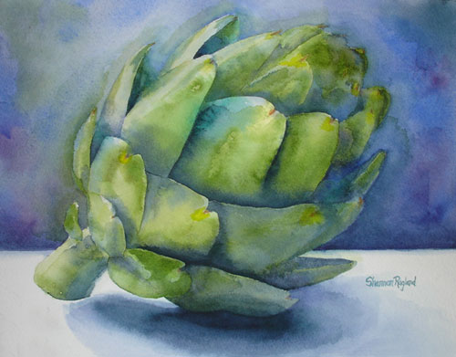
Homage to the Artichoke

So this is my first blog entry. How much pressure is this? Gee whiz.

So here is my last watercolor. Yes, it is an artichoke. I love artichokes. Anthony tells me that one day I will eat so many I will turn into one. When I completed this painting I uploaded it as my avatar/profile picture on MySpace. My sister's comment: "Holy Hell! Shannon's turned into an artichoke!"

My favorite childhood memory was sitting on my den floor with my whole family, eating steamed artichokes in front of the television. Not to date myself, but it was often an accompaniment to one of my two favorite tv shows, The Greatest American Hero, or Little House on the Prairie.

So we would put down beach towels and all sit on the floor, dipping artichoke leaves into a lemon-butter-garlic sauce, which remains to this day my favorite way to consume them. When we got down to the hearts my dad would surgically cut out the choke and we would all fight over pieces of the heart.

Even now I love them in front of the tv, but now my dachshund, Sadie, begs for some. She loves to eat the leaves (yes, I actually hold the leaf while she scrapes the meat off with her choppers) and she adores the hearts. I have pictures to prove it. But I also love artichoke hearts in pasta, salads, on pizza....you name it, I love it. So this is my homage to my favorite food, the artichoke.

EDIT: This piece was in the CCP Winter Art Show...see their link (Creative Catalyst Productions) in my "Art Links" at right for some wonderful still life art!